Automated email marketing is one of the most cost effective marketing strategies used by brands. Bulk emailing is inexpensive, and even if only a small percentage of recipients respond, it is still cost-effective. Email marketing, on the other hand, can produce significantly better results when done correctly.
Read on and follow these 25 email marketing best practices that’ll keep your customers engaged, improve your ROI, and get your campaigns going in 2021 and beyond.
1. Send Welcome Emails
Welcome emails help in the maintenance of your list and the delivery of your emails. If someone enters the wrong email address, the welcome email will generate a hard bounce. This then alerts your email provider to remove the email from your list.
They also reassure your new email recipients that their sign-up was successful and that the information they are looking for is on its way. They also assist you in connecting with new subscribers. Offer something valuable or exclusive at the start of their journey to increase click-throughs.
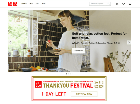
Source: Uniqlo
2. Time your email marketing campaigns well
Every email marketing provider wants their newsletter to be at the top of the inbox. After all, most subscribers will select the first emails they see.
When should you send your emails, then?
The best time to send an email is largely a personal preference. It varies according to location, industry, and audience.
The best email marketing practice is to use a send-time optimization algorithm. These tools adjust the send-time for each individual subscriber automatically, based on their previous behavior.
However, if you are unable to use send-time optimization algorithms, you should consider the following results and send your emails early in the morning.
3. Take it easy on the email frequency
Reduce the chances of your emails showing up in your subscribers’ spam folders by following this marketing automation best practice. As a result, your email’s deliverability improves. Building anticipation for your next campaign will increase your audience’s appreciation for you. Make them eager to receive your next major email campaign.
Consider this: A golden ticket is offered to you by an opt-in subscriber: they have entrusted you with their email address. So don’t spam their mailbox or utilize strategies like email blasts.
Setting your frequency is simple with elfoMap. This is because the email marketing platform allows scheduling and automatically resending your email campaign to subscribers who haven’t opened it.
Remember that while it’s simple to control how frequently you email, it’s often more difficult to see how many triggered emails are sent to your contacts each week–particularly if they’re sent in response to an action.
4. Use email deliverability best practices
Email deliverability is important to the success of your campaign. It makes no difference how interesting or beautiful your emails are. Subscribers will not convert if they never see them.
Verifying the email addresses you send to is one way to ensure that your email is read. This is easily accomplished by using an email checker to ensure that the email address exists and is valid.
Many marketers believe that email deliverability is solely the responsibility of their email service provider. But it goes further than that. Email content, frequency, and list-building strategies all have an impact on deliverability.
5. Use a memorable sender name
First impressions are important. In email marketing, it may also be the last one sent. If your email does not stand out and develop trust, your subscribers are unlikely to open it.
So, how do you go about doing that?
First and foremost, your sender name should be memorable and recognizable.
You also have to offer value. Always. This article has plenty of tips for that, so let’s focus on making your sender name identifiable.
Most brands use one of the following formats:
– [Brand Name]
– [Employee Name] from [Brand Name]
– [Employee Name] @ [Brand Name]
– [Brand Name] Customer Support
– [Brand Name] Newsletter
– [Brand Name] Digest
Here are some real examples from my inbox:
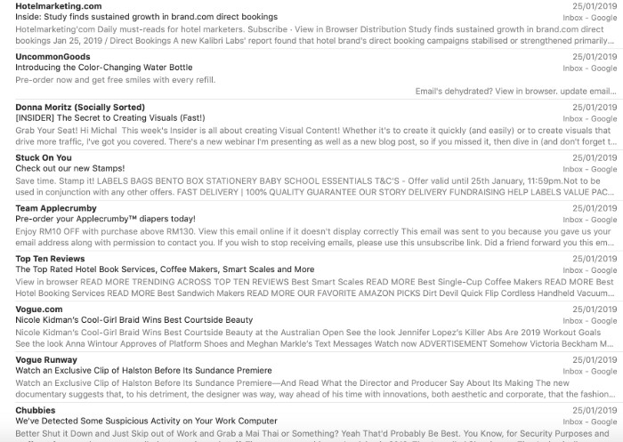
From name address examples from various brands
As far as we’re aware, no-one has ever studied which one works best.
It seems to be a matter of preference–and what suits your brand voice guidelines.
If you have a strong employee with a good personal brand who’s associated with a particular campaign, you could use the combination of [Employee Name] from [Brand Name].
Example: Abby from elfoMAP
Topic: New upcoming webinar
But that might not work for B2B emails when it’s more important for the communication to come from the brand itself.
Example: McKinsey
Topic: Mobile Ecommerce Trends in EMEA
So, take these ideas, compare them with your brand voice guidelines, and A/B test them. Then stick to the one that works.
6. Ditch the noreply@ address
The noreply@ addresses is a little ironic.
Most marketers will swear that their customers are at the heart of their operations. That they value their customers’ feedback, both positive and negative. Then, after earning their trust and persuading them to fill out an opt-in form, they use an email address that plainly states:
“We don’t care about you enough to check your inbox.”
I understand. The volume of auto-reply and out-of-office messages can be overwhelming at times. And sometimes your email does not appear to be one that will elicit a response.
Your customers, on the other hand, may have a different perspective.
Don’t make it difficult for them to provide feedback. Who knows, maybe those who take the time to respond will become your best brand ambassadors.
The advantages of dropping the noreply@ address outweigh the disadvantages.
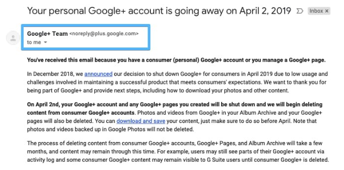
No-reply email address from Google+ announcing the closing of their platform
7. Test your email subject lines
Setting aside those who open every email, your recipients will generally only see three things before they decide to open or ignore your message:
- Sender name
- Subject line
- Preheader
So how do you write effective email titles?
Take time to craft your email titles.
Treat them as the most important element of your email marketing campaign – which they are. Don’t leave it as an afterthought. Set aside time to A/B test your subject lines. And use data, not your gut feeling.
Be creative. And try personalization and emojis. Both have shown to have a positive effect on average email open rates.
8. Use confirmed opt-in
Whenever we talk about good email practices, we always say email list quality beats quantity.
But we meet many marketers who are scared to use confirmed opt-in.
Here’s how it usually goes:
Q: But won’t it make my list smaller?
A: Probably.
Q: Won’t people be angry having to click the link to get my emails?
A: Some might.
Q: So why on Earth would you suggest using confirmed opt-in?
A: Because the benefits outweigh the costs. At least that’s what our data suggests.
When you compare the average email marketing results by industry with the use of double opt-in by industry data, you can see a link. Industries that use confirmed opt-in more often usually outperform those who don’t.
This article outlines why it’s worth using double opt-in. Why not give it a go?
At the very least, it will positively affect your deliverability–which is still a big win.
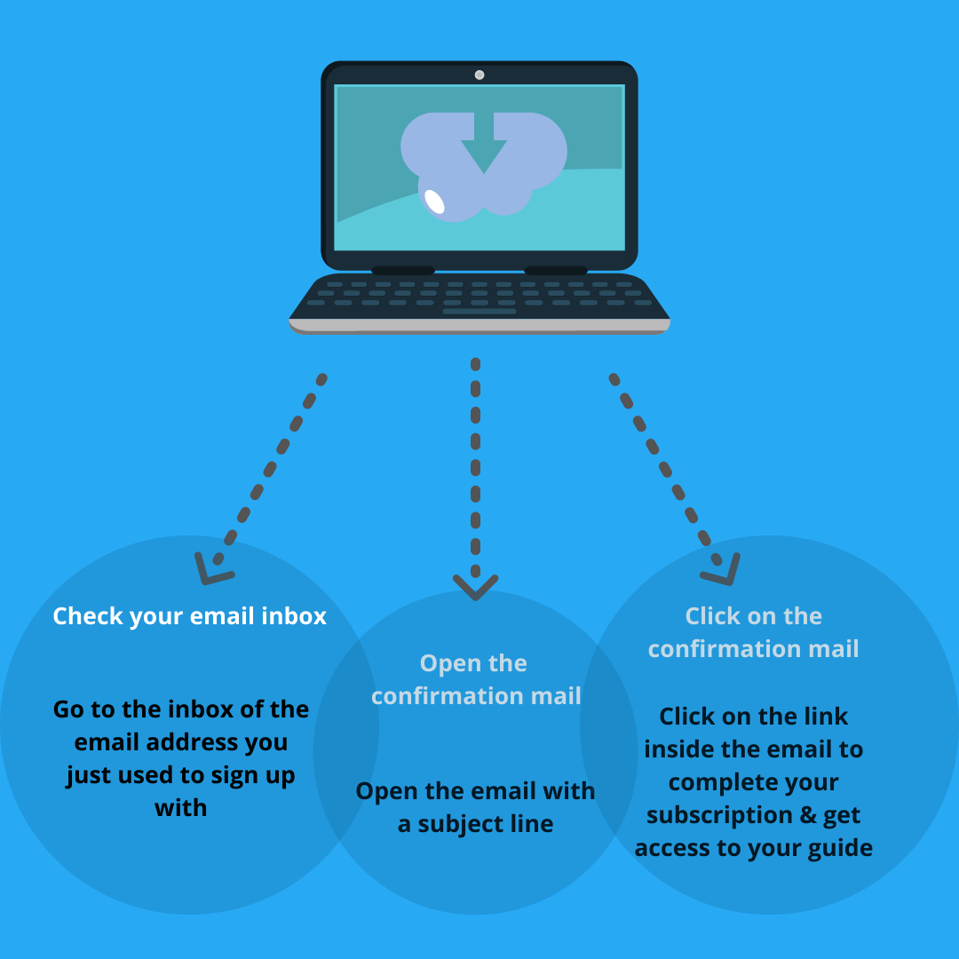
Clear instructions regarding the confirmation email presented on a thank-you page
9. Make unsubscribing easy
Here are a few pointers to help you make your unsubscribe process as simple as possible:
- Don’t make your subscribers log into your app to unsubscribe because they may have lost access to it.
- Explain to your subscribers why they are receiving your emails in the first place, for example, in the footer of your emails or on the unsubscribe page.
- Provide a one or two-click unsubscribe process via a hyperlink in the footer of your message.
- Use a common phrase as your hyperlink text, such as “Unsubscribe,” so that people can find it quickly in the message.
- Make the unsubscribe link large enough so that people using mobile devices can easily click on it.
- On the unsubscribe page, avoid using dark patterns or tricky copy.
10. Use lead magnets
Building an email marketing list is more difficult than it used to be due to increased competition.
A lead magnet can be an excellent way to provide value right away. Lead magnets, also known as incentives, freebies, or ‘bribes,’ are the most effective way to overcome people’s skepticism. It could be a downloadable ebook, a special industry report, a calendar, or some other enticing freebie.
Here’s a lead magnet we like:
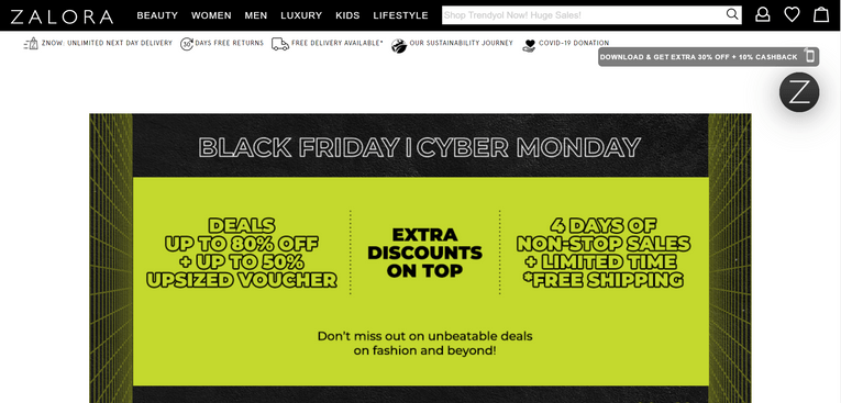
Source: Zalora
If you have not signed up with Zalora and open their landing page through website, you will see a box where they used lead magnet for customer to download their app and receive discounts. This will make their potential customers to download their app and use the discount.
11. Drive click-throughs with engaging content
What’s so special about emails you consider click-worthy?
If you look at your favorite newsletters, you’ll probably find some common threads. They either offer great products, interesting stories, thought-provoking articles, funny videos, or something else.
It’s a cliché, but you have to get creative.
12. Test your emails before hitting send
“Make no mistakes.” That would be a terrible email marketing tip!
As an alternative, suppose you should test and preview your emails before sending them. We’ve all seen emails with incorrect personalization, broken subject lines, or images.
Those who address you as Emma when your given name is Bob.
Those who say you’d look great in a dress but prefer cargo shorts.
Or those that are so shattered that you don’t know where to look.
All of these blunders, however, are avoidable.
Take the time to preview your emails in popular email clients, ensure they won’t end up in the spam folder, and send the message to yourself – before sending it to your entire list. It’s simple and only takes a few minutes to complete.
Inside the elfoMAP Email Creator, run an inbox preview email campaign test. Examine how your emails will appear in various web browsers and email clients.
It’s a good idea to double-check your emails for typos.
Of course, you could make a deliberate mistake as a stunt or joke. Just make it a good one–and don’t do it too frequently!
13. Audit your communication regularly
Automated email campaigns are frequently marketed as something that can be “set and forget.” That isn’t entirely correct.
What you include in your email communication isn’t always going to be timeless. Your language, the things you’re referring to, or the images you’re using may become not only out of date, but also insulting or opportunistic.
With so much going on in the world around us, we must be cautious about our messaging and how others will perceive it.
So, make auditing your automated email communication a habit. Something you do once every quarter or two. This way, you can keep your messaging relevant, engaging, and, most importantly, considerate. Your audience will respect you for it and remain loyal to your brand as a result.
14. Design emails for accessibility
There are ways to make your emails easier for the public to access.
First, add ALT text to your images. People using a screen reader can then understand the content better.
Tip: Add a period after the image text. The screen reader will then pause, so it’s easier to understand your email.
You can also check the image contrast ratio to improve readability.
15. Focus on the right metrics
The email open rate is often considered a vanity metric. The click-through rate is more actionable, but it still doesn’t tell you how much revenue your campaigns generate.
So, it’s best to learn about all the key email marketing metrics and how to choose them to suit your objectives.
16. Use a matching pre-header
Do you remember we said the sender name, subject line, and the preheader are the first things subscribers see?
Even if half your subscribers open your message on the subject line alone, the rest are swayed by other things. While they’ll likely see the sender name first, the pre-header still plays a part.
This is especially the case for email campaigns with shorter subject lines, since the preheader will take up more space. The preheader can enhance your email subject line and increase your open rates.
Take a look at these examples:
Email subject line: Drop Everything. Sitewide Sale. Now.
Preheader text: It’s our birthday 🎉 Sitewide Sale + Free Shipping & Returns to celebrate!
Subject line: It’s now or never!
Preheader: Only 8 hours left on these Cyber Monday deals
See how the preheaders add more information to sway someone to open up?
Here’s a creative subject line and preheader combo that caught our Chief Wordsmith’s eye:
“and the winner in the “Best Valentine’s Day Subject Line/Preheader Combo” category is… @phrasee (why am I not surprised?) pic.twitter.com/YOdBnzmtbc “
— Karolina Kurcwald (@karolstefan) February 14, 2019
So, pay attention to your preheader.
17. Inspire action
Finally, in order for email marketing to be successful, your subscribers must take action.
However, there are times when you need to give them a little push. When designing your emails, make sure the recipients understand what they should do next.
Is it to sign up for a webinar? How about downloading an ebook? Or perhaps they could share your storey with their network?
Whatever it is, ask for it!
To do that, you’ll need calls to action (CTA). These can be either buttons or plain text. It is preferable if you test them. The fewer calls to action there are, the more attention they will receive.
Their design and placement are also important.
Keep them visible and easy to find–especially on smaller devices such as mobile phones. Play with the copy and elements surrounding your calls to action to make them more powerful. You could, for example, include a countdown timer or mention when the offer expires. Or, for added credibility, include a testimonial.
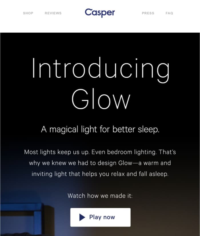
Creative call to action copy in a newsletter from Casper

Descriptive call to action button copy from Uncommon Goods
18. Use the thank-you page strategically
What do you want your subscribers to do after they fill out your subscription form?
Do you want them to get into the habit of opening your emails? Perhaps you could even be designated as the safe sender? Or do you want them to come to your blog instead?
Your thank you page can assist you in accomplishing all of this. That is, if you use it wisely.
Consider the following:
The user has just indicated that they trust you and wish to receive content from you. It’d be unwise to waste that opportunity and offer them nothing in exchange.
Thank you pages can assist you in increasing deliverability and open rates. They can also assist you in increasing traffic to your most important pages. Not to mention that they have the potential to increase your conversions.
19. Make your emails skimmable
We’re all very busy these days.
We are also constantly distracted by various things, people, and marketing messages. That’s why we frequently take the simplest and quickest route to completing a task, whatever it may be. This approach also applies to email reading and inbox cleaning.
As a result, if you want your emails to convert better, make sure to communicate your message as soon as possible.
Structure your content so that it is simple to read and understand. To state your main message clearly and quickly, use bullet points, headlines, lists, and preheader text. If you do it correctly, you should see an increase in email engagement metrics, such as click-to-open rates.
Here’s one brand that I know does it well. Take a look at their email address, which is listed below.
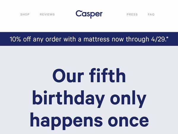
Casper newsletter
Effective use of the above the fold section in Casper’s newsletter.
You don’t even need to scroll below the fold to get the gist of the deal. They’ve covered everything important in that single sentence, which is displayed prominently.
This method is excellent for two reasons. It saves the subscriber’s time – they can skip ahead if they aren’t interested – and allows the brand to quickly capture the attention of those who are in the buying mood.
Simple, yet effective tactic. An email best practice worth adopting.
20. Use a professional email marketing tool
Of course, we’d say that.
After all, among many other features, elfoMAP offers email marketing software.
But that’s not why I’ve included this best practice in this list.
Marketers frequently begin their businesses by sending marketing messages from their own company domain using a tool like Outlook or Apple Mail.
Your business grows, and so does your email list. At some point, you notice that people aren’t responding to your messages, even though they seemed interested in your offer just a moment ago. Their shift in behavior may not be due to an ineffective sales pitch, but rather to how you send your email campaigns.
Email marketing tools like elfoMAP assist you not only in making your emails look nice (with free mobile-responsive templates and features like the Email Creator), but also in managing your reputation and effectively delivering your messages.
21. Design a marketing funnel
A single marketing channel cannot function on its own.
You must have an audience if you want to sell your products or services online. To have an audience with whom to speak, you must first build an email list. To do so, you must first create a landing page and direct traffic to it. After that, you must provide them with a lead magnet and nurture them after they have successfully signed up.
This process goes on and on, and it’s easy to become disoriented along the way.
This is where marketing funnels come in. They’ll assist you in making better use of your marketing channels, staying on track with your business goals, and increasing conversion rates.
The good news is that although marketing funnels may sound a bit intimidating at first, they’re pretty simple to set up. Even simpler if you use a tool that helps you create them automatically.
22. Segment your audience
Sending an email blast to your entire list may work occasionally.
However, your chances of generating sales with email campaigns are best when you create personalized content for specific customer segments.
You’ve probably heard of the Pareto principle.
20% of your customers account for 80% of your sales revenue.
Is it possible? Don’t just take my word for it. Just verify it.
Identify the key segments, such as your most engaged subscribers or those with high RFM scores, determine how much revenue they generate, and target them separately with your email campaigns.
If you can’t find these customers, stick to the segments that come to mind right away (the chances are you know your audience so well that you’ll recognize the best segments without doing any additional research).
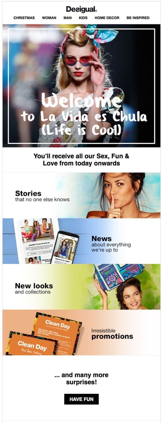
Welcome email from a brand named Desigual
Notice that the message is divided into several topic sections. By using this tactic, the brand can segment their audience using the click-through data
23. Use targeted pop-ups
Despite how you feel about them, popup forms are one of the most effective methods for building email lists. Plus, there’s a way to make them less annoying for those who aren’t looking to join another email list.
The solution? Targeting.
Ask yourself these questions when building your web forms:
- When should the web form appear?
- When should it be hidden?
- Should it be shown to the same user again, and if so, how often?
Since you don’t want to irritate your users, you’ll want to present your option forms only when it makes sense.
Tip: To determine the best time to display your web forms, consider the average time users spend on that page as well as your bounce rate. We like to configure our forms so that they only appear when users have demonstrated an interest in the content they’re reading.
24. Use your header to entice people to read on
Getting people to open your email is only the beginning. To entice them to click on your offer, you must first draw them in and entice them to scroll through your message.
Making good use of the above-the-fold section, particularly your header, is a great way to accomplish this.
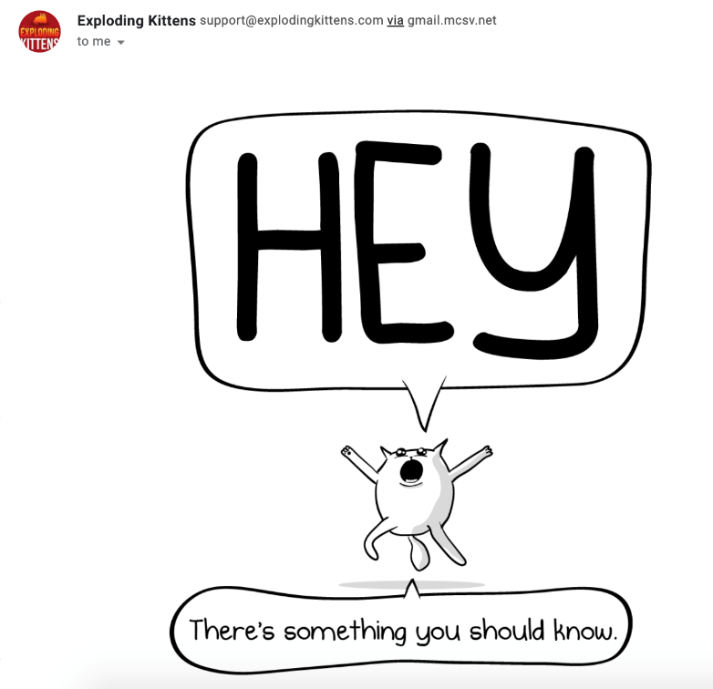
It is undeniably noticeable. Because most of our emails do not resemble cartoons, it immediately catches our attention.
There’s even more. The cat in the picture is trying to tell us something, but we won’t know what until we scroll down.
So, what are we to do? If that’s our sense of humor, we’ll definitely scroll down and learn about their offer.
Of course, this approach will not work for every brand, so let’s look at another example.
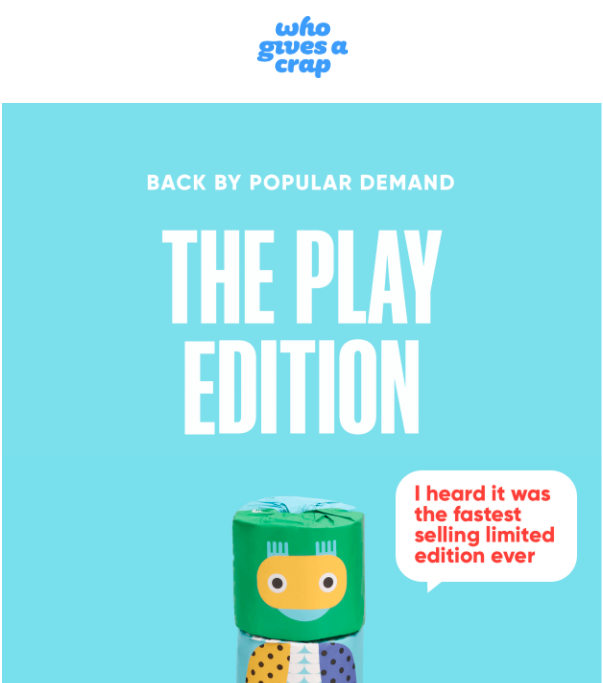
The circumstances are very similar.
A big headline declares that this product has been reintroduced due to popular demand. It makes you wonder if whatever it is, if people are asking about it, it must be good, right?
So, we scroll down and notice a bubble that says, “I heard it was the fastest-selling limited edition ever.”
Again, you’re thinking: OK, it sold out really quickly. It must be very good now.
So, what are you going to do? You continue to scroll and learn more about their offer. These are only two examples, but I believe you get the idea. The email header should entice recipients to open your email. It must capture their attention and persuade them to continue scrolling down.
Pro tip: Keep in mind, most email headers contain a call-to-action link, and that’s what you should do, too.
From our experience, most email recipients click on the first button they see in the email (especially in ecommerce) and continue their journey on your website. So, make sure always to add that hyperlink to your header image and drive people to your website.
25. Make better use of the footer
Most email marketers make inefficient use of their email footer. They only use it to provide all of the legally required information, such as an unsubscribe button or their company address, and that’s it.
However, there is so much more you could do with your footer. It may also assist you in driving more conversions.
Here’s an example from Magic Spoon that carries a promise of happiness.
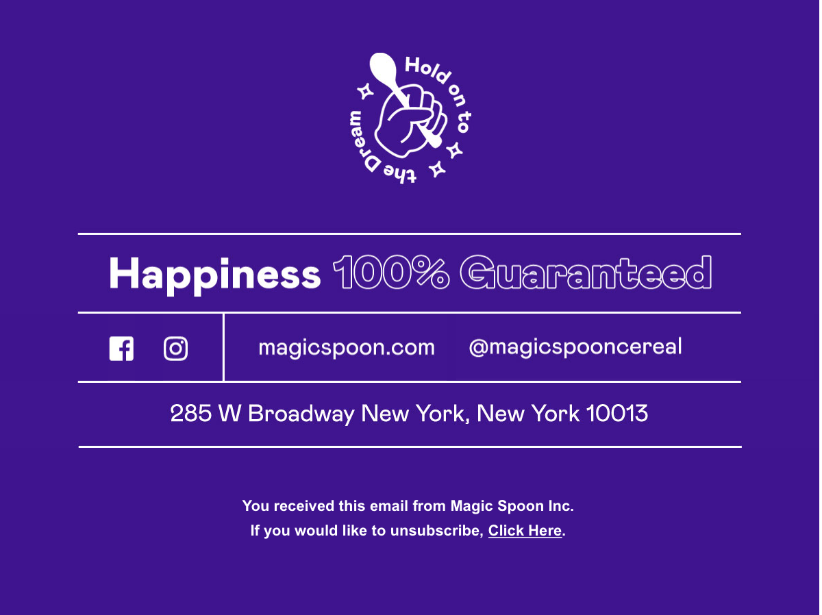
Source: Magic Spoon
Here are a few more ideas you could include in your footer:
- A quote from your customer acting as a social proof
- Logos of the sites that featured you
- Your unique selling proposition, like 100% money-back guarantee or world-wide free returns
- Option to review your message
- Results of your latest newsletter give-away
Your next steps
You now know all our recommended email marketing best practices.
We’ll keep it updated with more actionable email marketing tips to help you improve your campaigns.

